I really like your first scribble @pixelkind, the ‘cuteness factor’ is definitely there
It should also work as a favicon, which might be a problem with @mrdrogdrog s Cody (at least the variants with a pen, which might just get too small to be discernible).
As we already talked about on Matrix, I think the drafts are great. I also prefer the borderless version, but think they fit better into some sort of explanation section just to represent the mascot than as a logo.
As already mentioned, I think this is caused by the fact that they are painted in profile which makes it less jumping out to you, which at least from my perspective a logo should do.
Every time there’s a rebranding in a free software community, a plethora of logos sprout up, and often ends up in a gallery of horrors. Logo design by committee can be a heck of a nauseous ride.
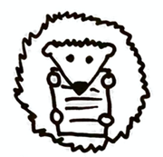
Hence my joy at seeing the first proposal here! I find @mrdrogdrog’s original Cody – why not Codi? – really cute and recognizable.
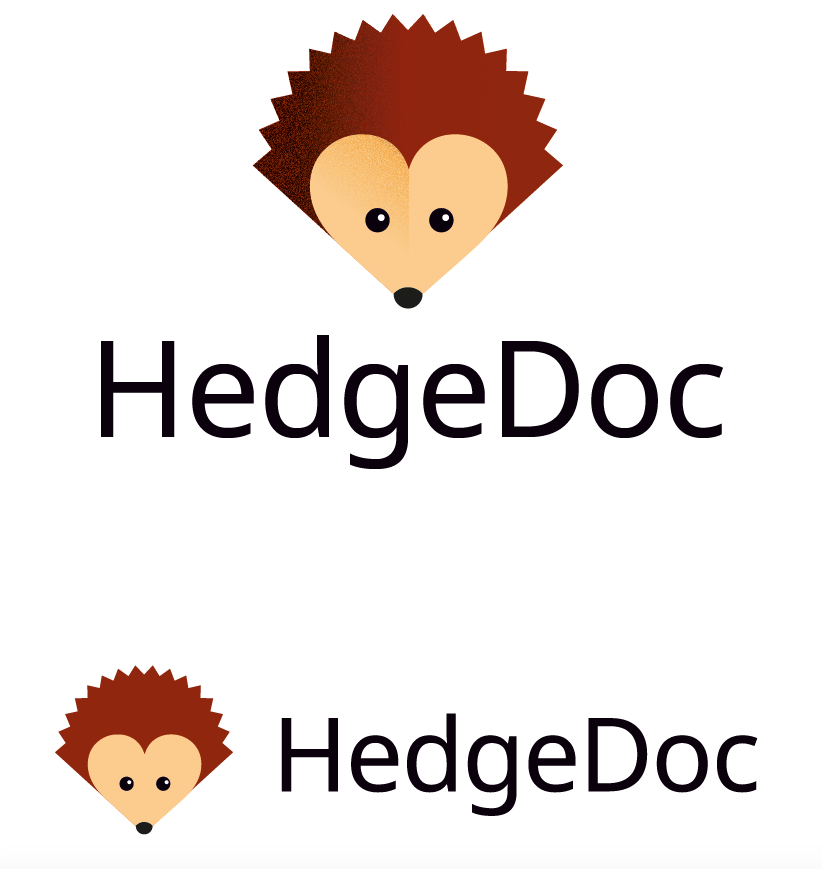
Unlike its author, I prefer the one with the pencil on its shoulder, but it’s a matter of taste, and this character can be easily put in many different contexts and situations. For example, the HedgeDoc logotype could have it rolled in a ball to make the O in doc, or even be “written” “Hedge ”.
Another reason I like the is that it’s an animal that is barely considered anywhere by the literature. Some suggested it was because of its promiscuity. As a gardener, I enjoy very much the presence of hedgehogs around, as they’re voracious of slugs and insects that can be deadly to edible plants.
Thank you all for your hard work and fantastic community!
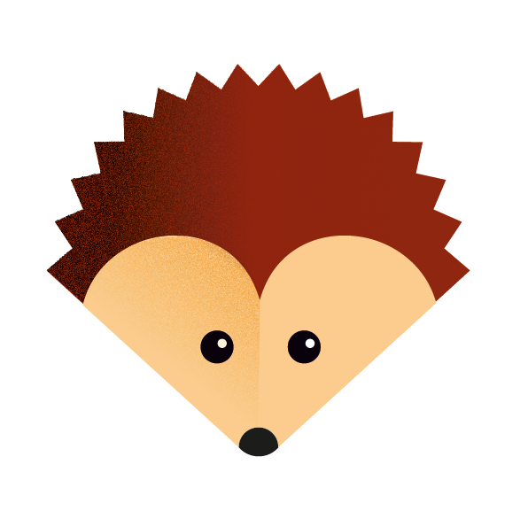
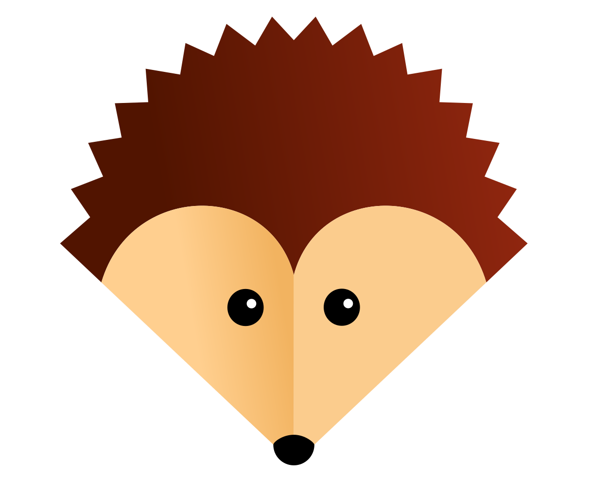
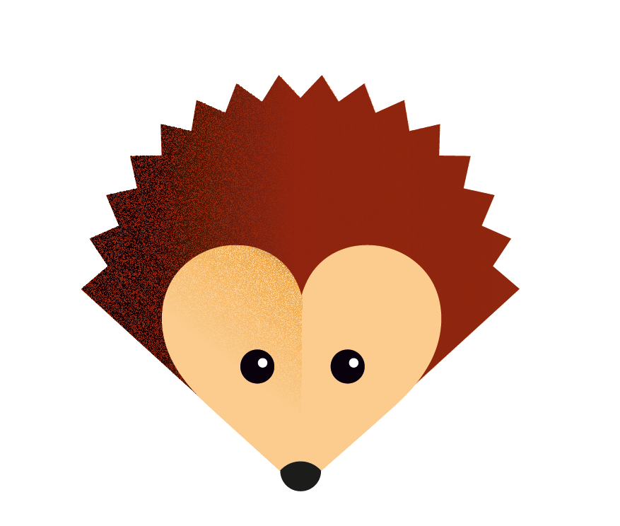
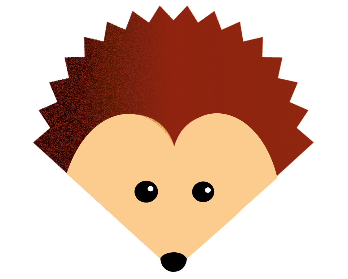
The only thing that bothers me is the part where the curved line of the heart meets the straight line of the outer shape. In my eyes that doesn’t match.
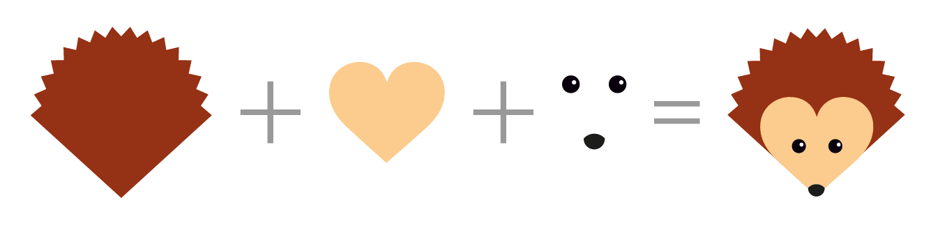
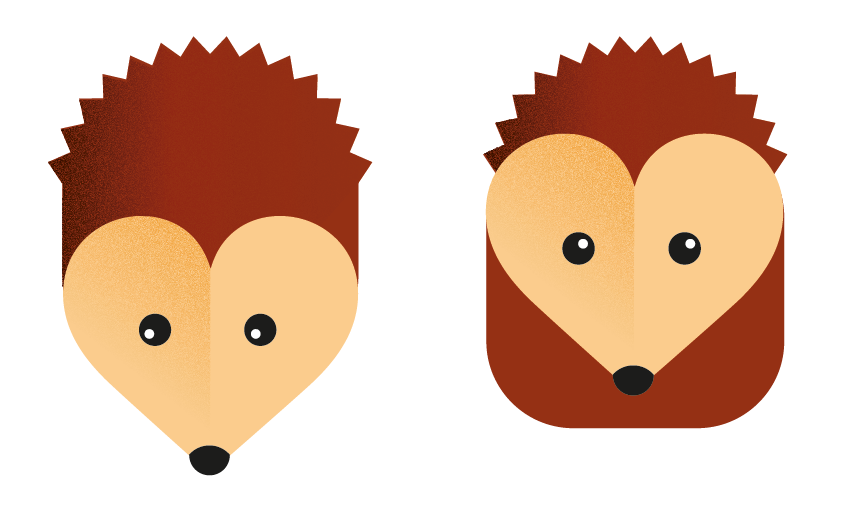
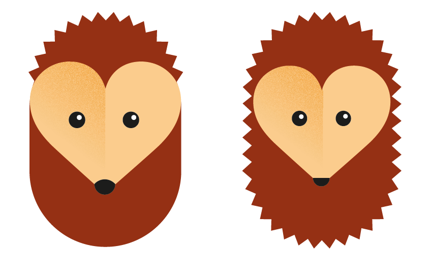
I created a quick draft of an alternative version.
But the alternative version looks a bit more boring than the heart version. Don’t get me wrong! I really like the idea with the heart … but something is wrong.
Any idea for a solution that is somewhere in the middle?
@eric_G
I’d definitely think we should pursuit the first book-like hedgehog. I have just a few points:
Could you maybe remove the spray paint effect on #16?
Maybe we could replace it with a gradiant?
I think your first nose design was better than the current one.
The logo looked more like a pen with the old nose, which I think is a great aesthetic for a collaborative note taking tool.
Great stuff, all of you.
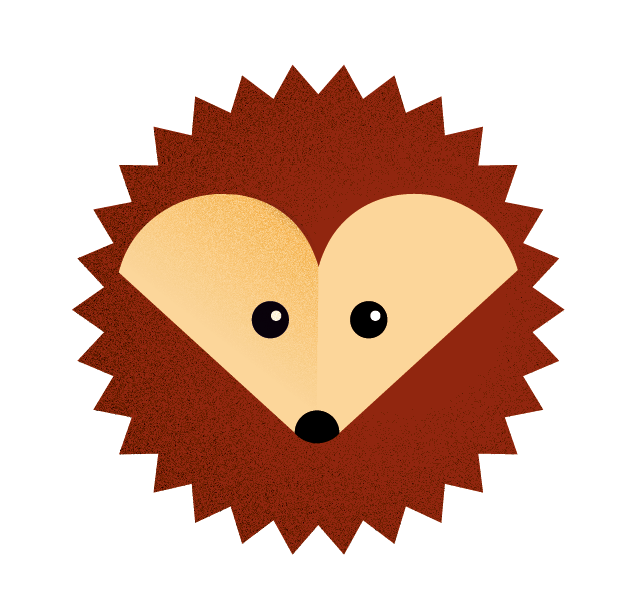
Just because I like the heart-shape so much: @eric_G: How would a full circle like in #17 with the (fully) heart shaped face look like? Would you be so kind to make me a draft?
I think it’s time to decide which logo idea we should pursue.
Please vote below which of the suggestions you find most appealing. You can give each of them one to five points. The poll will close in one week. Please note that the poll is not for choosing the final look, but just the idea. We will probably iterate a bit before choosing a final design.


 ”.
”.
 <
<