Hedge Banner
Not really a Logo. More a text banner idea.
Inspired by my good friend @davidmehren
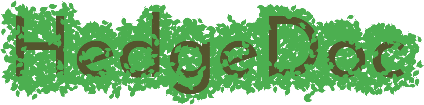
EDIT: I changed the font color. It’s more color blind proof now according to https://mapeper.github.io/jsColorblindSimulator/#
Not really a Logo. More a text banner idea.
Inspired by my good friend @davidmehren
EDIT: I changed the font color. It’s more color blind proof now according to https://mapeper.github.io/jsColorblindSimulator/#
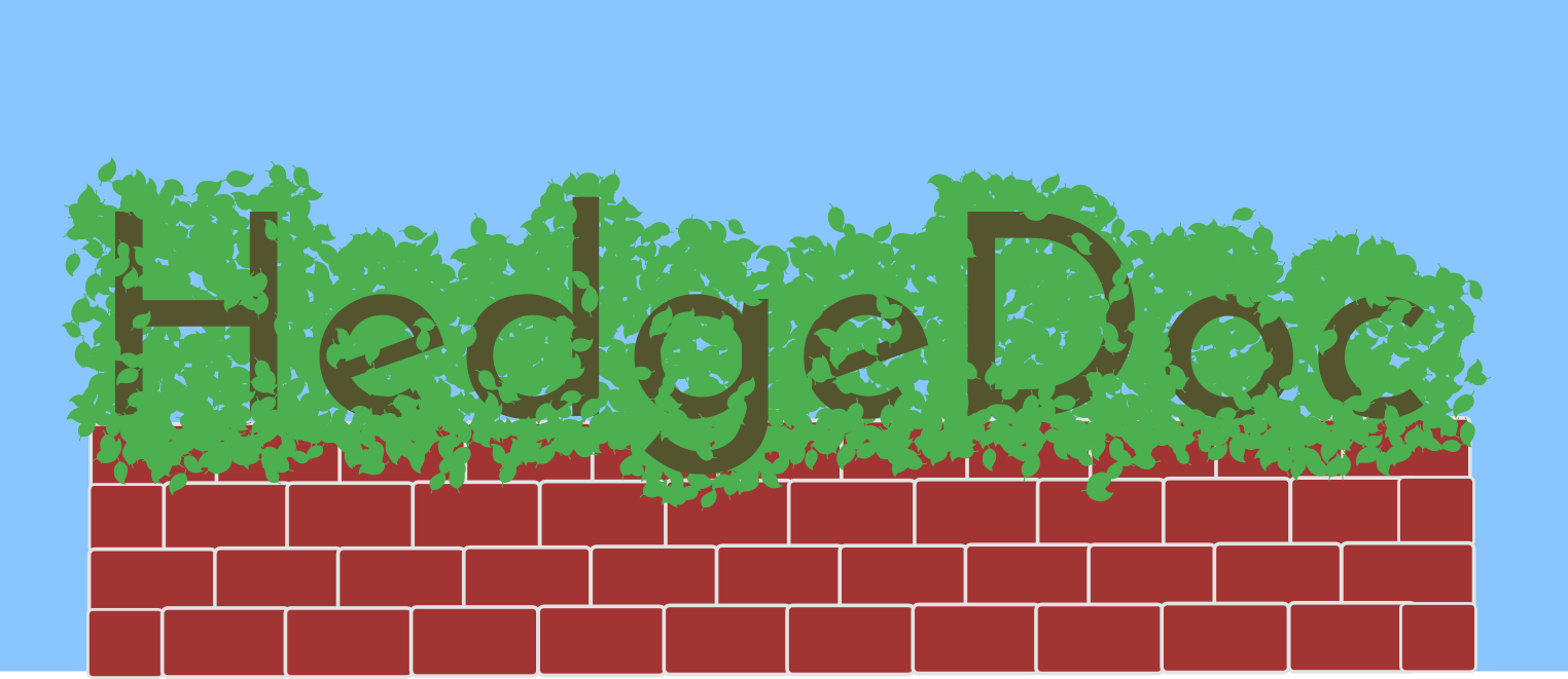
I was bored and played around with the draft 
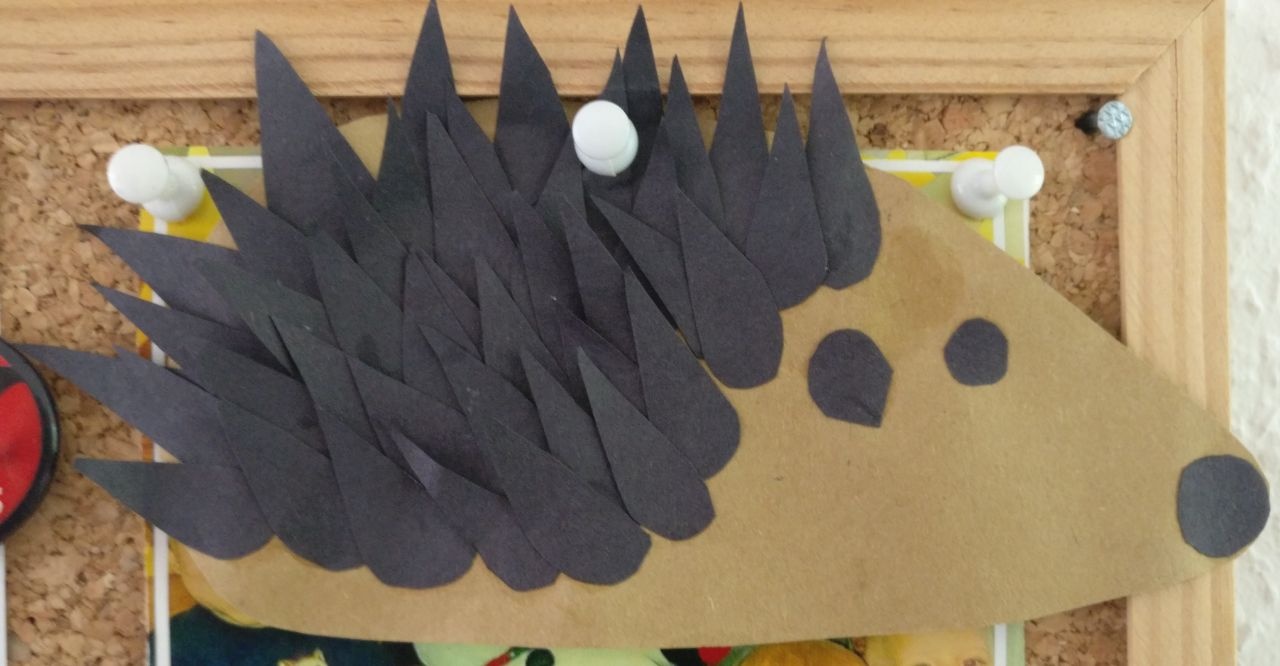
Found that today and though it is cute.
Every time there’s a rebranding in a free software community, a plethora of logos sprout up, and often ends up in a gallery of horrors. Logo design by committee can be a heck of a nauseous ride.
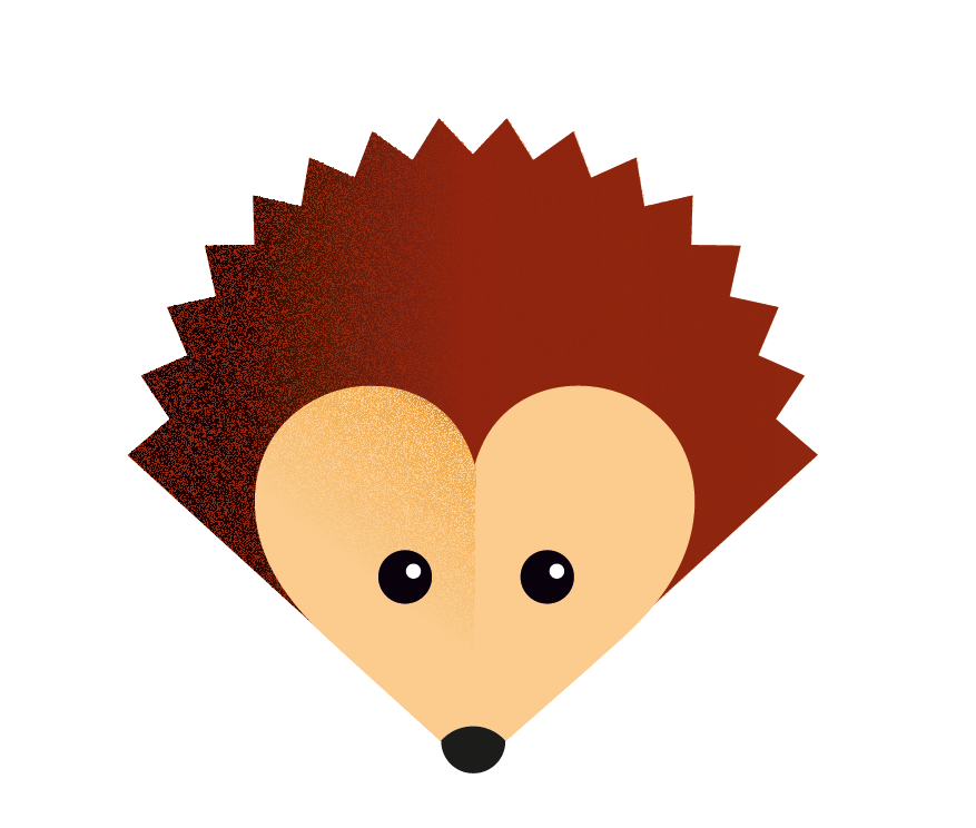
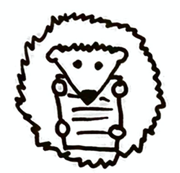
Hence my joy at seeing the first proposal here! I find @mrdrogdrog’s original Cody – why not Codi? – really cute and recognizable.
Unlike its author, I prefer the one with the pencil on its shoulder, but it’s a matter of taste, and this character can be easily put in many different contexts and situations. For example, the HedgeDoc logotype could have it rolled in a ball to make the O in doc, or even be “written” “Hedge  ”.
”.
@pixelkind’s proposal can be another variant.
Another reason I like the is that it’s an animal that is barely considered anywhere by the literature. Some suggested it was because of its promiscuity. As a gardener, I enjoy very much the presence of hedgehogs around, as they’re voracious of slugs and insects that can be deadly to edible plants.
Thank you all for your hard work and fantastic community!
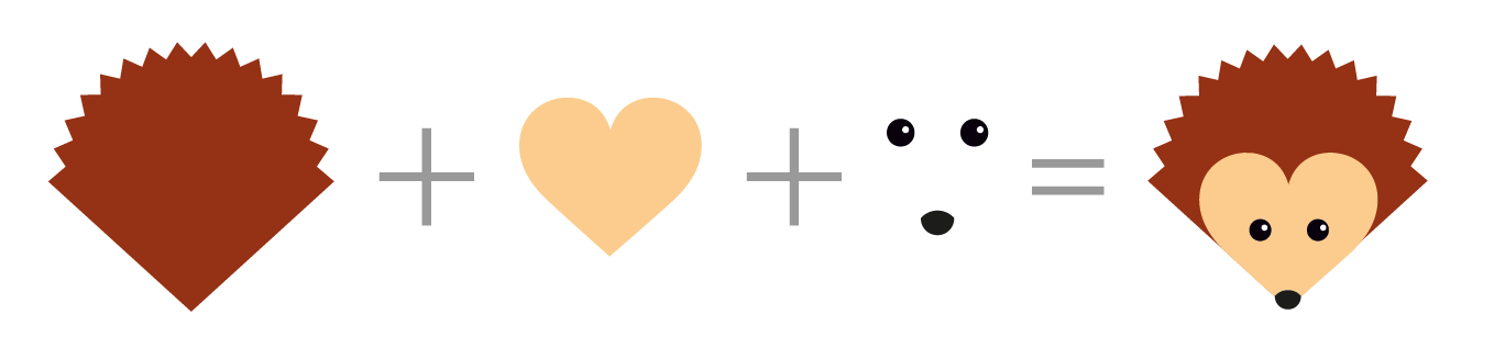
Hello, here is my logo formula:
Of @eric_G s suggestions I prefer this one, because it’s more square.
I like the idea in general! It’s simple and unique.
The only thing that bothers me is the part where the curved line of the heart meets the straight line of the outer shape. In my eyes that doesn’t match.
I created a quick draft of an alternative version.
But the alternative version looks a bit more boring than the heart version. Don’t get me wrong! I really like the idea with the heart  … but something is wrong.
Any idea for a solution that is somewhere in the middle? 
I’m quite fond of #16.
@eric_G
I’d definitely think we should pursuit the first book-like hedgehog. I have just a few points:
I think you mean like this?
(I was bored and created an svg with inkscape for experiments)
Great stuff, all of you.
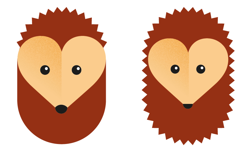
Just because I like the heart-shape so much:
@eric_G: How would a full circle like in #17 with the (fully) heart shaped face look like? Would you be so kind to make me a draft?
How long will this thread be open for suggestions?
I think it’s time to decide which logo idea we should pursue.
Please vote below which of the suggestions you find most appealing. You can give each of them one to five points. The poll will close in one week. Please note that the poll is not for choosing the final look, but just the idea. We will probably iterate a bit before choosing a final design.
For other variants see https://github.com/mrdrogdrog/hedgedoc_logo
0 voters
For other variants see here
0 voters

For other variants see here
0 voters
For other variants see here, here, here and here or just scroll up a bit 
0 voters
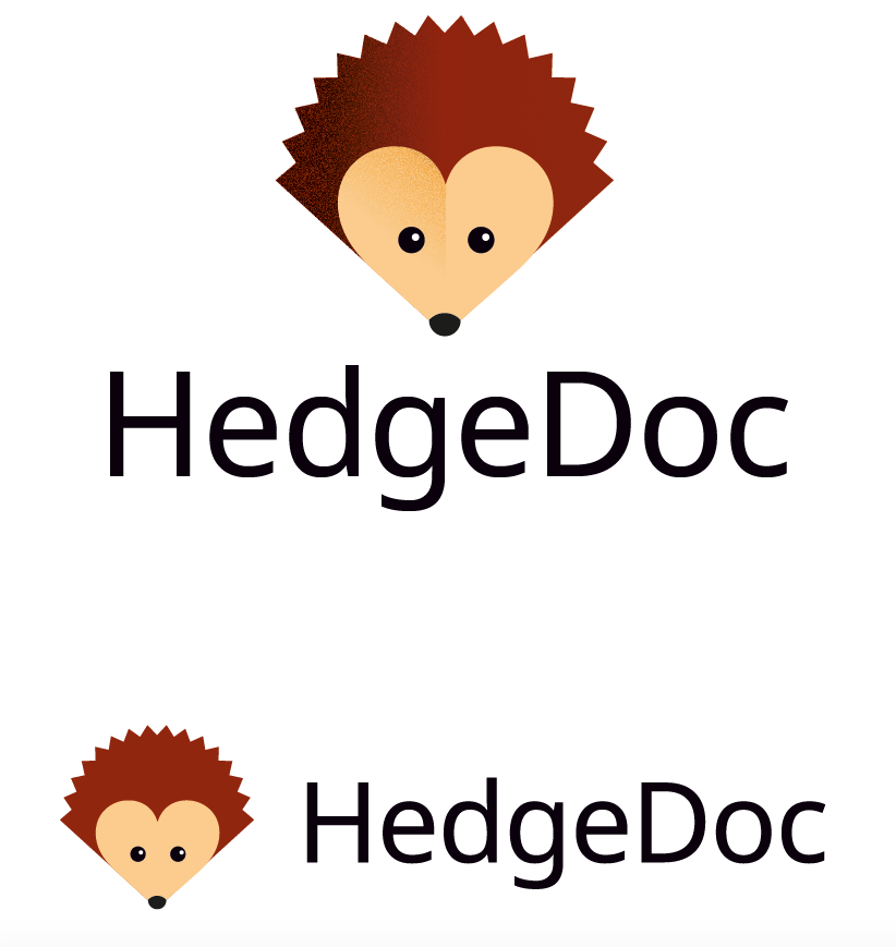
Aaaand the winner is @eric_G (gg! Very good draft!) Now we have to agree on a variant and the details
Looks like we got a nice result here  I think that was a good first iteration and thanks to everyone who handed in crafts and ideas. Now we should go for the second round where we try to polish the logo with the most votes. But obviously new ideas are still possible in the next iteration. So those who want to polish their own version and put it out there again, are free to do that, too.
If you are short on time or similar let us know so we can try to figure something out. Would be a shame to lose an awesome logo draft just because one has a busy week.
Anyway, again thanks to everyone participating, in both, the design of logos and the selection. You make a big difference in the community and I look forward to your future contributions 
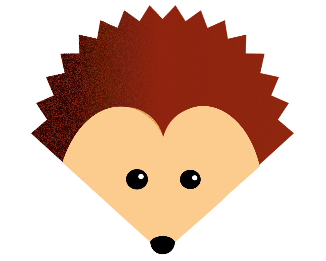
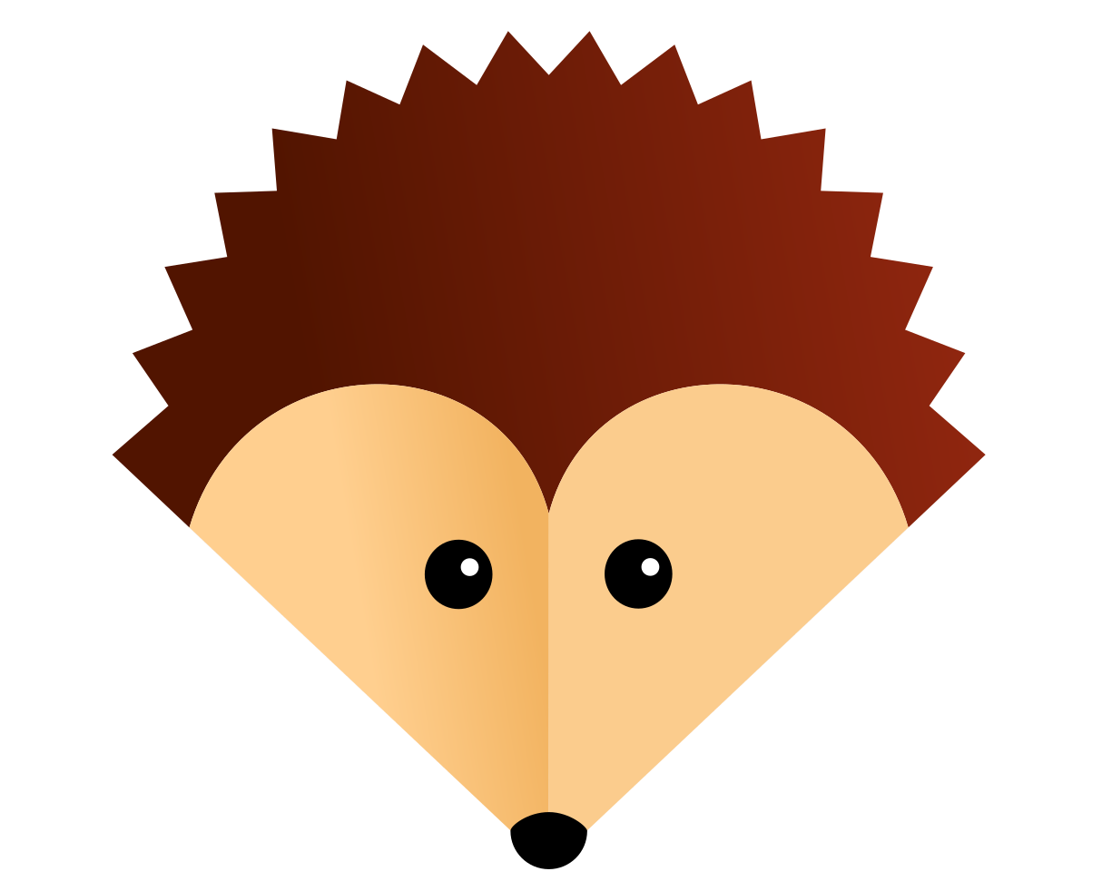
I prefer this variant. The spray effect is rather disturbing and doesn’t fit the plain design. Also you don’t see it on low resolutions.
Also I prefer this shape for the face because it makes it look more like a pencil
 <
<