Great stuff, all of you.
Just because I like the heart-shape so much:
@eric_G: How would a full circle like in #17 with the (fully) heart shaped face look like? Would you be so kind to make me a draft?
How long will this thread be open for suggestions?
I think it’s time to decide which logo idea we should pursue.
Please vote below which of the suggestions you find most appealing. You can give each of them one to five points. The poll will close in one week. Please note that the poll is not for choosing the final look, but just the idea. We will probably iterate a bit before choosing a final design.
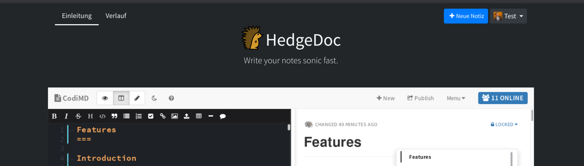
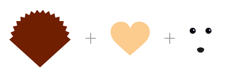
Cody by @mrdrogdrog
For other variants see https://github.com/mrdrogdrog/hedgedoc_logo
- 1
- 2
- 3
- 4
- 5
0 voters
A design by @pixelkind
For other variants see here
- 1
- 2
- 3
- 4
- 5
0 voters
Hedge banner by @mrdrogdrog
For other variants see here
- 1
- 2
- 3
- 4
- 5
0 voters
A design by @eric_G
For other variants see here, here, here and here or just scroll up a bit 
- 1
- 2
- 3
- 4
- 5
0 voters
Aaaand the winner is @eric_G (gg! Very good draft!) Now we have to agree on a variant and the details 
Looks like we got a nice result here  I think that was a good first iteration and thanks to everyone who handed in crafts and ideas. Now we should go for the second round where we try to polish the logo with the most votes. But obviously new ideas are still possible in the next iteration. So those who want to polish their own version and put it out there again, are free to do that, too.
If you are short on time or similar let us know so we can try to figure something out. Would be a shame to lose an awesome logo draft just because one has a busy week.
Anyway, again thanks to everyone participating, in both, the design of logos and the selection. You make a big difference in the community and I look forward to your future contributions 
I prefer this variant. The spray effect is rather disturbing and doesn’t fit the plain design. Also you don’t see it on low resolutions.
1 Like
Also I prefer this shape for the face because it makes it look more like a pencil
I think I like the variant of @eric_G that @mrdrogdrog did, the best. The gradient works much better than the spray effect.
I think some variants we could try from there:
- a more heartshaped face, therefore more of the body would be visible, but as @mrdrogdrog mentioned we have the curve / straight line colliding then
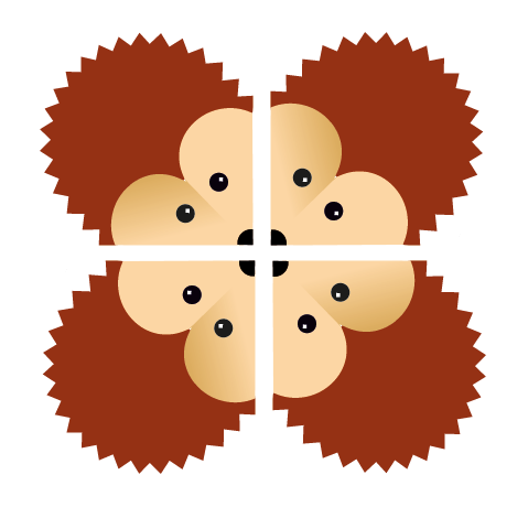
- the round version, but I‘m not sure what we could do with the lower body. It currently is a bit bare. Maybe we could use this logo as a rolling progress indicator?
1 Like
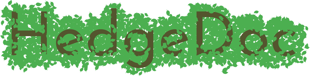
HedgeDoc logo proposal
Proposition by eric_G
The initial idea
The initial idea was to mix an open book shape and a heart to make a hedgehog

-
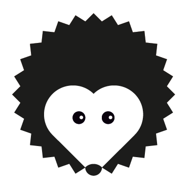
Some after thoughts
- The result looks a bit flat
- Nose poping out: too cartoon
- The shape is not a perfect circle
- The spiny coat angles are too sharp
- The black version does not work (we do not visually connect the white face)
Improvements
- Rationalize shape using squares and circles
- Should fit a circle
- Easy to redraw from memory
- Should also work in black only
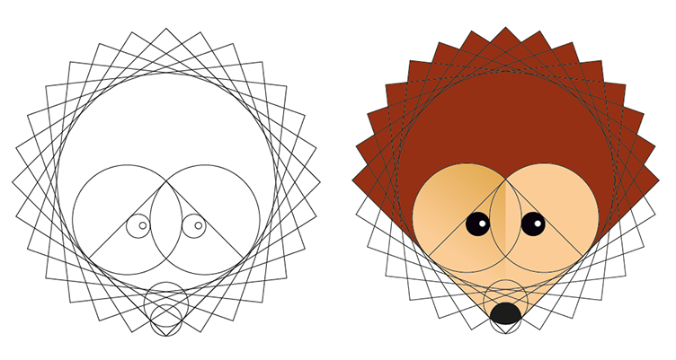


- Despite the spiny coat we have a round shape
- By closing the shape we have a logo that works in black and white
- And finally giving more shape to the heart…

Possible variation

3 Likes
I’m still more into https://community.hedgedoc.org/t/time-to-find-the-hedgedoc-logo/171/22, because it looks more like a pencil, which is a nice reference for a software for collaborative WRITING
But from your proposals I like https://community-hedgedoc-org.hot-objects.liiib.re/original/1X/93017e602261937cced51867882ac93448f4e49c.png the most. But can you use the other nose? Imho It’s much cuter
Hi! Than you for the great work you’re doing!
To answer your direction question from the chat: I prefer the V form. I actually like that it’s not a perfect circle, it gives the logo more character. The pencil look is also nice.
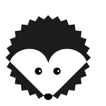
I don’t think the unconected white face in black-white is problematic, thanks to the nose being there i don’t miss the “line” there. (Maybe try just adding a thin black line at the face’s edge in black and white only?)
I disagree on the nose popping out looking too cartoonish, I think it looks much cuter.
I also have to disagree with @mrdrogdrog, I prefer the round heart/face shape.
So in summary, this version with the “old”, protruding nose would probably be my favorite.
This Logo brings interesting things compared to the previous proposal. among its quality:
- it is more dynamic (no symetry)
- brings writing idear (good for an app about collaborative writing)
- niice interaction between the logo and the name letters (he seems to finish drawing the d)
- taks adventage of the three parts letter spacing → | Hed | ge | Doc |
- the logo can rotate
hedgehogs collaborating
1 Like
The first idea I have when I see this is, that there is an opportunity for interaction between the… hedge…pen…doc… (I dunno. we should find a name for our mascot. I still like Cody  ) and the text.
As you already said he seems to finish drawing the d.
I think there is a chance to design the text itself.
EDIT:
I searched around on google fonts and found (again) pacifico. It would fit the “the pen writes something” idea… But I don’t think that it’s a good idea. Too playful.  )
)
of all these, I like the one @eric_G has as his avatar the best. it looks likethis one, but with a larger face, right?

(marked 6 in the post above)
2 Likes
A humble opinion.For a free software project
- Logo should have minimum elements
- Minimum number of color, preferably binary
- It should easy to print and should be easy to make sticker
- Now a days making embroidery on t-shirts and bags are common. So lines should have enough thickness to accommodate three or four threads
- If possible, friendly enough for press cutting of metal sheets.
- Also should be able to maintain the identity while seen at very small size like on browser tab
Just a suggestion. This may be applicable to all type of logos, but for Free Software it is essential. In general, in a free software software project the fair use policy on logo can support the promotion of project, but the policy will be really useful, only if the logo is usable.
4 Likes
Isn’t the 6.2 proposal going in this direction, @Sooraj_Kenoth? I’m sure there can be variants and adaptations for various materials.
6.2 looks great!
I still think that, although 6.2 can make a great icon, the HedgeDoc logo should be flexible, in the sense that I’d love to see this mascot around, playing with documents, or being a pencil, etc. But I dislike the “variant” version which I find too sharp on the face – although after looking at it in context (with the logotype) it makes sense.
I’m a bit afraid of the regularity of the spikes, maybe some wind could come into play ![]()
Anyway, I can’t wait to see it in action!
We’re done with this topic. A new logo is found, worked out and uploaded.
2 Likes
Thanks for everyone participating We made it to find the new logo and are currently working on the rename with full steam.
If you have any further questions or think you want further artwork, feel free to open an issue in the logo repository linked by @mrdrogdrog.